Hanky Panky Color ~ A Parisian Metaphor
By ELLEN LEWIS
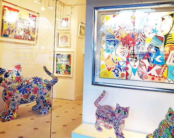
Prior to the show in Paris, I was wandering around the Marais on my way to a meeting when I happened upon the Gallerie Hugo (pictured here with a bit of glare). This explosion of color was a welcome respite on a grey and rainy day. I actually stopped to take a look. I never know how I might use imagery I come across on the blog. But, I figured that this scene might serve a purpose as I begin my market marathon with the fall 2019 expositions.
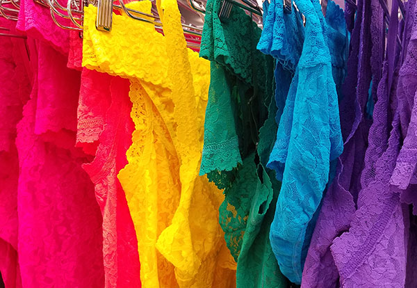
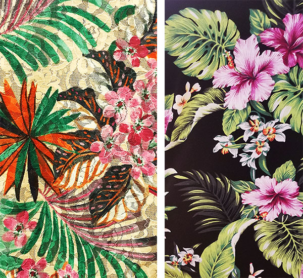
I found a perfect metaphor when I returned to New York. One of my first stops was Hanky Panky, ostensibly to get a fall preview. Again it was a cold and misty afternoon. However, the burst of color on display in the NY showroom, though not unexpected from this playful brand, instantly reminded me of that moment in France when the atmosphere shifted outside that cheerful gallery. Hanky Panky’s acumen with print and color is part of their enduring signature, and certainly I have called it out before. But every season it continues to excite me. Maybe I am a color junkie, but this year, with the growing importance of feel good apparel and innerwear accessorizing an outerwear statement, Hanky Panky is right on the money.
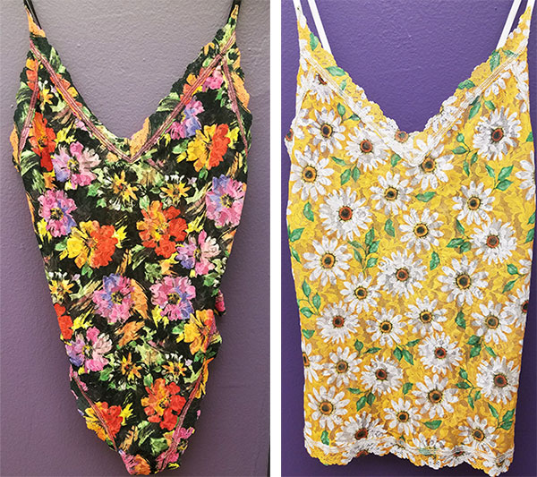
“I Prefer Living in Color” ~David Hockney
